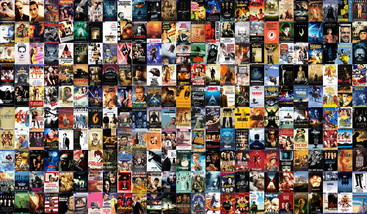
And everyone strangely went along with it. To make it worse, some genuinely great films own get the shitty poster treatement. So Willam and Cookie have gotten together to go through the worse movie poster for great films .
Here are Cookie's, stay tuned for Will's!
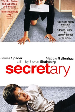
I cannot possible speak for the original poster of Secretary. For all intents and purposes, that is an excellent one; the curvaceous buttocks of our lead actress suggest a highly sexual relationship that is significant to the film. The title spelt out in typewriter keys as a secretary would use. It’s all extremely well put together.
This poster, however, is not. In fact, it makes the intensely brilliant indie flick that centres on normalising fetishes and BDSM sexual preferences, look like a loopy romantic comedy. It’s the wide eyed look of James Spader that harkens right back to his eighties days. It doesn’t scream “thought provoking fantastic independent film.” Instead, this more poster screams, “he’s got a new secretary and she’s sexually bizarre, uh-oh.” Added to this are the taglines that are the worst selection of quotes as they actively heralded this erotic comedy as something from the Carry On era.. File this under: how not to sell our excellent film.
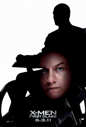
The brilliant thing about X-Men First Class is that it rejuvenated a series that was going down the pooper faster than our love for Wolverine. The exhausted and banal superhero franchise about mutants had run its course when Origins came around and we all screamed “nobody cares Mutton Chops McBoneClaws.” So the chance to see a young Magneto and Professor X gallivant around together before they became mortal enemies was tantalising to say the least, especially when they are played by the delectable James McAvoy and Michael Fassbender.
So why does the poster look like something from a nineties pop album? The silhouette with the faces incomplete and fading are as if the people in charge skipped the Photoshop lesson of Graphic Art. Or maybe the budget went to painting Jennifer Lawrence blue and didn’t extend to the promotional material.
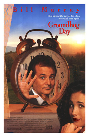
Bill Murray is something of an icon. He has stared in multiple childhood favourite films and as you grow up, you realise that he has starred in your favourite adult movies too. In fact, his mere presence in cinema is simply divine from Lost In Translation to Ghostbusters and more. In 1993, he starred in this fantasy romantic drama that brought to life his satirical dead pan humour in a truly excellent way. It revolves around television egomaniac weatherman who heads to a small town of Punxsutawney to report on their annual titular holiday. However, he finds himself stuck in a time loop, repeating the day over and over again.
So how do you convey that in art form? In true early nineties fashion, it is this weird cut and past job of actors faces in very “ru-oh trouble” angles. Explaining why Bill Murray is placed inside a clock on a weird window sill with Andy McDowell placed in the corner as though someone just discovered Paint. It is terrible, awful and even Bill Murray looks pissed off at this. Look at those eyes, they are screaming for help.
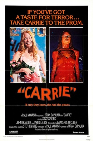
There is a worst poster than the 1976 original horror flick from Brian De Palma and it’s last years remake. But as that was a terrible film to begin with, we can excuse its blatant disregard of the initial outing by plastering “You Will Know Her Name” all over it (as if we didn’t know). The 1976 version of the film poster isn’t that great either despite the fact that the movie is an unnerving bloody horror. Carrie revolves around a timid bullied girl that is abused by her over bearing and religious mother as well as her class mates. Yet the pressures around her sees her develop a supernatural power.
The annoying thing about this poster is that it gives the whole affair away. As you settling down watching the film, you’ll know that eventually this shy person gets to go to prom and it all goes a bit pear shaped. Thee cheesy tagline only makes it worse because Carrie has much more depth than stereotypical horror farce that this poster seems to make it out to be.
If only they knew how to make a film look tantalising...
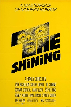
The Shining is possibly one of the scariest movies of all time based on a book with similar spirits. Kubrick developed a disturbing supernatural tale of a haunted hotel full of mind fuckery that spelt terror for the Torrences who resided in it. There is not one moment of it that isn’t encapsulated in thrilling scenes as Jack dwindles into insanity and tries to kill his family. The movie has so much terrifying potency that any scene could be plucked to ominously sell the film to audiences. And in many versions, they pick the most memorable scene of Jack’s face maniacally through the axe cut door.
In this version? I don’t even know, What the hell is that thing? Why is it bright yellow? Proving that you shouldn’t take LSD before embarking on poster making, this is a manically disturbing poster.
No, we’re serious now, what the hell is that thing?
What Do You Think?
Has there been a bad poster?
Maybe a recent one has you fuming?
Let us know in your comments!
Keep waiting for Will's part two?

 RSS Feed
