by Charlotte Fraser
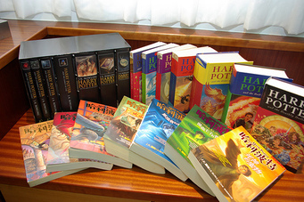
The Harry Potter Series, known worldwide and loved by millions (perhaps even billions!) has had many different looks over the years dating back to 1997.
In this article, in celebration of World Book Day, IWG Books has decided to look at all the different looks of the series, and choose our favourite!
What is your favourite? Tell us in the comments!
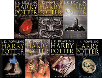
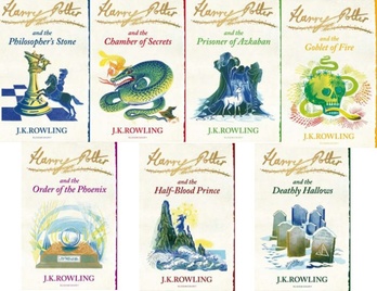
The 'Adult' Look
A look that was made for older readers. This look is sophisticated and makes the books seem more grown up than the other covers. Which is a good thing, because Harry Potter isn't just for your childhood, the story, the characters, and the message of the series lives with you long after. Having this version of the series on your shelf makes it look elegant and sophisticated.
This look is the most classy of all of the cover-art.
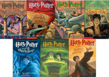
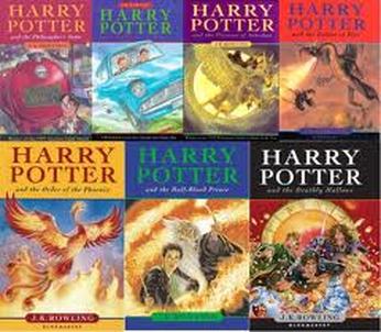
American Version
In America, the Harry Potter series is published by Scholastic, and because of this, not only the name of the first book, The Philosopher's Stone (In America it is known as the Sorcerer's Stone) was changed, but the art was, as well.
These covers are what most American fans of the series have grown up with, and their illustration is impeccable!
The Latest
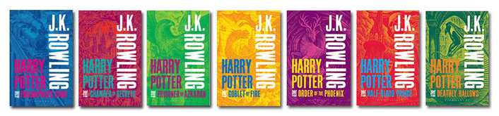
The Latest covers to be released are these colourful ones! There have been mixed reactions about these covers, and we can see why! Each book seems to have a colour scheme, and they are very bold and 'out there'. It seems like the publishing company is trying to sell the books now from a different angle, when they don't particularly need to. However, whether the methods are questionable or not, these covers are certainly eye-catching!
A Simple Look
For those who like simplicity, this version of the series sees the books in white! Something that has previously not been done. This version of the series is beautifully illustrated, as are the rest of the covers, and they would look very pretty indeed on your bookshelf!
In this version, the covers show something that is relevant to what happens in that book at that time on the cover. The thought that was put into these covers was excellent.
Original British Publication
All of the versions of Harry Potter are amazing in their own ways, but there is just one version that you simply cannot beat! That's right, the original British Cover-Art!
This look is favoured by most of the fans of the series for a very simple reason. This version of the books are the ones they have grown up with and will treasure for many, many years to come. It wouldn't be surprising if the fans read this version of the books to their own children, and so on.
Really, there is no competition. The rest of the faces of Harry Potter are indeed fantastic, but when it really comes down to it, there is a clear winner.


 RSS Feed
